Supply and Demand Zones
Supplementary indicators to identify potential buying and selling price targets. Both for trading and investing
Hello everyone!
Learnt something really useful today that I didn’t know before. It is to do with analyzing price charts (aka technical analysis)
No time to read all? Skip to the summary at the bottom.
I’m gonna journal it down here for my own learning records but if you’re reading this I hope this gives value to you too! Plus, I’ll point you to where I learnt it so you could join me too if you’re keen.
Before you read on, if you’re new to candlesticks and how to read them, watch this short video (good refresher too!)
Okay, what are supply and demand zones?
Essentially these are zones or price ranges where lots of money (often whales like institutional funds, billionaires etc) set their limit orders to buy or sell shares of stock. Usually, at these zones, you’ll most likely see a start or reversal of a trend.
But why can’t they (big money) just buy in at a specific price as we retail investors do?
Well, imagine buying a couple of million bucks where of shares… If the supply of shares is limited (it is on a normal day), it would cause a significant jump in price (the law of supply and demand). And usually, big money whales don’t do that, they scale in and out of positions.
Identify a demand zone (Potential buying zones)
A demand zone is identified in hindsight. But here’s the great thing… As long as the zone is not invalidated (you’ll see later), moving forward in time it becomes a good buying opportunity zone (the same idea applies to supply zones).
We always start identifying the zones from the monthly charts and then on the weekly and finally the daily (if you’re day trading you can zoom in more to the hourly and minutes)
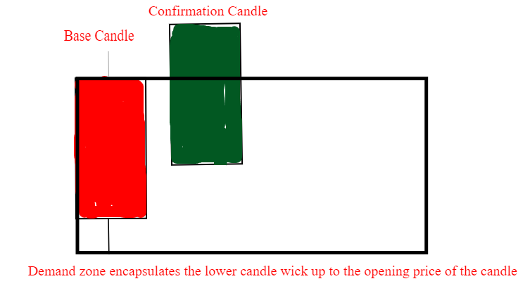
Demand zone setup:
The upper wick (if there is) of the base candle is not taken into account. Why? because the sellers have stepped in to push the price down. The bottom wick is taken into account because it shows that buyers came in to push the price up.
Validation of demand zone is when a green candle appears after the base candle. Ideally, the green candle should break out of the demand zone (black rectangle).
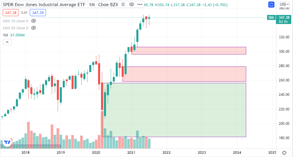
Real chart example: Dow Jones ETF (DIA)
Ideal examples of demand zones still in play are shown in red rectangles (remember, start identifying them from the monthly charts first as they give a clearer picture).
Also, start identifying the demand zone from right to left. (ie. look at the latest candles first as they are the most recent history)
*Notice the large blue rectangle at the bottom* I’d personally still count it as long as the candle after the base candle doesn’t break down below the demand zone identified using the base candle. Notice that the candlestick bounced off it when prices retraced.
That’s what a demand zone helps you do, it helps identify buying zones (as long as they’re still valid). In the example above, we see the prices represented by the candlestick rebound at the demand zones. It shows that there were possibly many limit buy orders in that price range.
Identify a supply zone (Potential selling zones)
A supply zone is a zone or price range where limit orders are placed to sell shares. It acts as a resistance to share price.
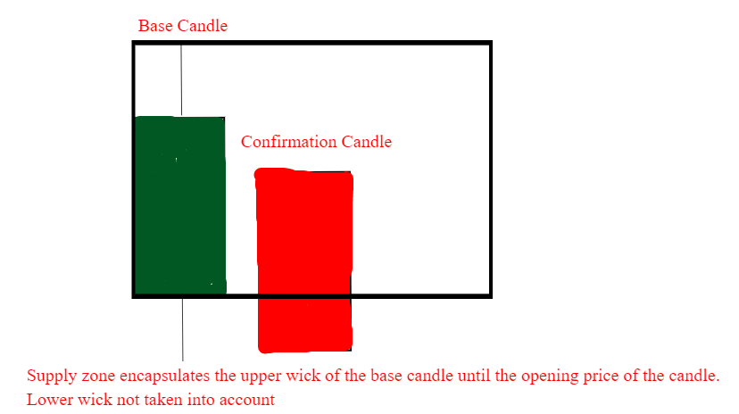
Supply zone setup:
The base candle ideally should be green at the top of a trend. The confirmation candle should ideally be red and validation of the supply zone is when the confirmation candle breaks below the supply zone (black rectangle)
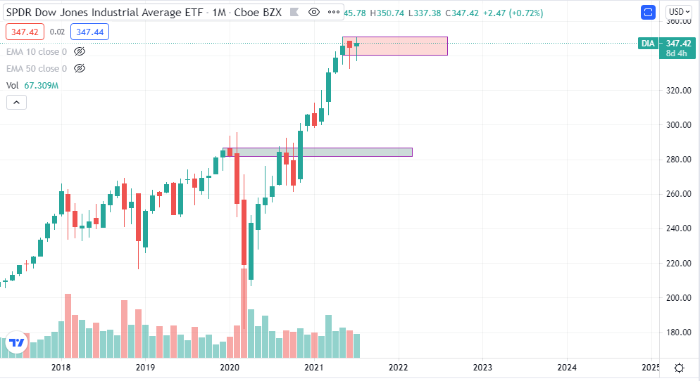
Real chart example: Dow Jones ETF (DIA)
Ideal examples of supply zones still in play are shown in the red rectangle (remember, start identifying them from the monthly charts first as they give a clearer picture).
Also, start identifying the supply zone from right to left. (ie. look at the latest candles first as they are the most recent history)
*Notice the blue rectangle* I’d personally still count it as long as the candle after the base candle doesn’t break out above the supply zone identified using the green base candle. Also, notice that it became invalidated later when prices move up breaking through the supply zone.
Supply zones help you identify selling price ranges where big money set limit orders to sell shares. This of course if the supply zone is still valid.
Summary, TL: DR
Demand zones = Price range where big money set limit buy orders to buy shares.
Supply zones = Price range where big money set limit sell orders to sell shares.
Big money/whales are what move prices of the markets, not us retail investors. So we want to try to find what price range they could be buying and selling at.
To identify supply and demand zones:
1) Start identifying them on monthly charts first then zoom down into weekly and daily.
2) Identify from the most recent candlesticks (ie. look from right to left of your screen)
3) Look for base candles and then confirmation candles. Draw a rectangle to mark the zones. Zones should encompass the entire body and lower wick of the base candle for demand zones and the entire body and upper wick of the base candle for supply zones.
4) Once marked out, they act as potential support (demand zones) and resistance (supply zones) for share prices.
**Zones are invalidated when the price breaks down below demand zone or breaks up above supply zone.
**Any gapping up or down of candlesticks do not count as confirmation candles.
Hope this helps you! As always, we’ll get better at identifying the more we practice!
Always good to have a reliable community to provide feedback and learn together.
If you’re looking for a good one, I’d highly recommend mine, it’s where I learned this.
Link here: https://bit.ly/JIC2021Preview (Click through to access free recorded classes)
Also, if you’re interested in learning options and how to use it to supercharge your investment returns, I’d highly recommend this masterclass which I’ve been through myself
Link here: https://bit.ly/OMI2021 (Click through to access free weekly preview)
Cheers,
Justin


